BLOCK: UrVenue Buttons
Button Collection Generated using The styles filled in the Theme Builder
(UrVenue Theme -> Global -> Uv Theme –> Buttons Style.
Contrast Buttons
UrVenue Buttons Fields
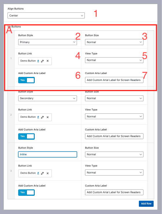
1.- Align Buttons: Left, Right or Center.
A) Single Button: Single Button details, Click Add Row if we cant add a new button.
2.- Button Style: Select button style (Primary Button, Secondary Button, Inline Button).
3.-Button Size: Button Size (Small, Normal, Large).
4.- Button link: Link Button.
5.- View Type: Normal or contrast (contrast is used opposite background)
6.- Add Custom Aria Label: use a custom Arial label (if it is off, as the default Arial label the button label).
7.- Custom Aria Label: Custom arial Label Text.
Block: UV Simple Block
Test
Lorem ipsum dolor sit amet, consectetur adipiscing elit, sed do eiusmod tempor incididunt ut labore et dolore magna aliqua. Ut enim ad minim veniam, quis nostrud exercitation ullamco laboris nisi ut aliquip ex ea commodo consequat. Duis aute irure dolor in reprehenderit in voluptate velit esse cillum dolore eu fugiat nulla pariatur. Excepteur sint occaecat cupidatat non proident, sunt in culpa qui officia deserunt mollit anim id est laborum.
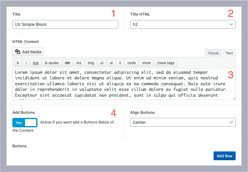
1.- Title Block
2.- HTML Title Tag: Select HTML Tag of the title
3.- Block Content: Textarea for the block
4.- Add Button section: Add button collection, use the same settings on BLOCK: UrVenue Buttons
Block: UrVenue Two Cols Section
A Simple Columns Section Created that displays Graphic media on one side and the second column filled with Information

1.- Swap The order Of the columns
2.- Change the simple Image for a slider.
- a) Upload/Select Collection
- b)Show/Hide Nav Arrows in the carousel

3.- Upload/select The Background Image in this section
4.- Upload/select the Column’s Image
5.- Title
6.-HTMl Title (Select The HTML tag to use in this section)
7.- Content (accept Customs HTML Content)
8.- Buttons List: these use the same settings used on UrVenue Buttons
Example:
Two Colums Section
Lorem Ipsum is simply dummy text of the printing and typesetting industry. Lorem Ipsum has been the industry’s standard dummy text ever since the 1500s, when an unknown printer took a galley of type and scrambled it to make a type specimen book. It has survived not only five centuries, but also the leap into electronic typesetting, remaining essentially unchanged. It was popularised in the 1960s with the release of Letraset sheets containing Lorem Ipsum passages, and more recently with desktop publishing software like Aldus PageMaker including versions of Lorem Ipsum.
Example 2:
Two Colums Section
Lorem ipsum dolor sit amet, consectetur adipiscing elit, sed do eiusmod tempor incididunt ut labore et dolore magna aliqua. Ut enim ad minim veniam, quis nostrud exercitation ullamco laboris nisi ut aliquip ex ea commodo consequat.
CTA Banner
Block Name: UrVenue CTA Banner
Section Usually used on Giftcard.

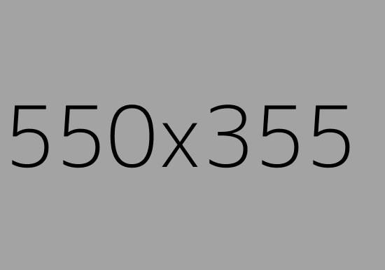
1.- Feature imaged (usually we use a card design), size required for optimal visibility on all screens sizes 550px x 355px
2.- Gift Card Title
3.- Content paragraph for this section: Accept custom HTML tags inside of it.
4.- Background Color for the banner
5.- Buttons List: these use the same settings used on UrVenue Buttons
Example:
Banner Section
Block Name: UrVenue Banner Section
Section that uses the full width of the page adding a background in it.

- Section Title: type the title of the section.
- HTML Title: HTML tag is used on the title. The regular option is “H2” to match the global theme Title styles.
- Subtitle: Type the Subtitle. If you don’t have any information to fill in, you can leave the field empty.
- HTML Subtitle: HTML Tag is used on the subtitle. The regular option is “H3” to match the global theme subitle styles.
- Content: Content paragraph for this section: Accept custom HTML tags inside of it.
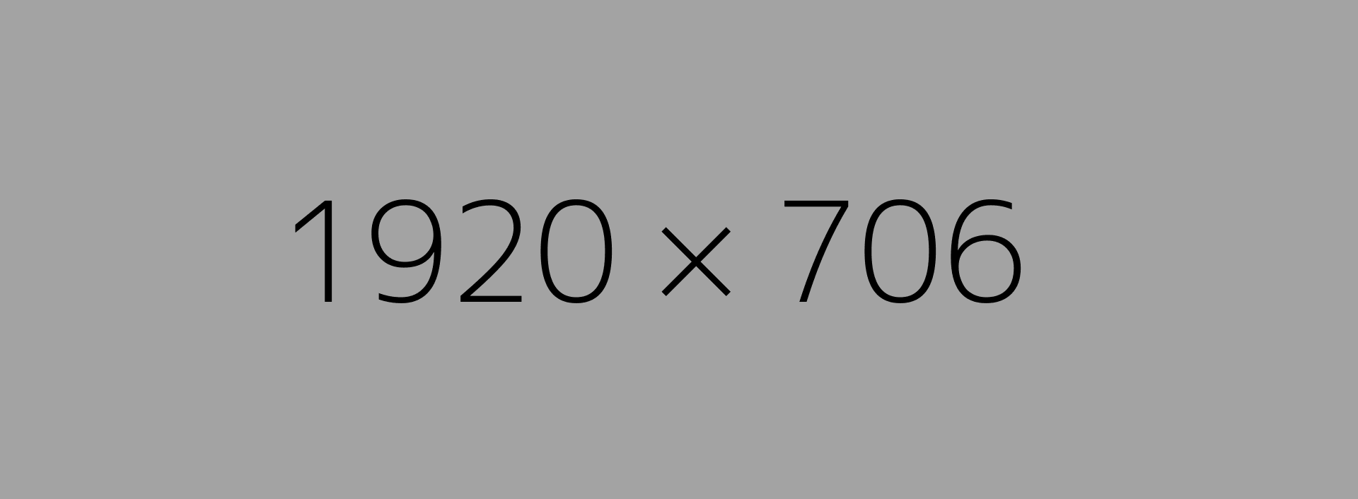
- Banner Background: Background of the Section, Size required 1920x 575 px
- Banner Overlay Color: This color picker allows you to select the overlay color above the banner Background.
- Banner Overlay Opacity: Slide field where we can select the overlay percenter of the Overlay Color. If you don’t want to display it, use 0
- Uv Buttons: these use the same settings used on UrVenue Buttons
Example:
Title Banner Section
Sub Title Banner Section
MAP Block
Block Name: UrVenue Map Section
The block shows the venue/store’s location on a map using information from Google Maps.
Recommendation: Always use/search for the location’s info, not the location’s direction.
Example of this:
[Good]

[Wrong]


1.- Geo Location from the Maps. exaple from the maps Link

Latitude: 32.785845
Longitude: -96.7892279
2.- Location name.
3.- Location Address:
4.- Contact Fields: Email and Phone number, Fields using CTA ACtion for call/mail
5.- Uv Buttons: these use the same settings used on UrVenue Buttons
6.- Pointer Field In the map, select the location of the Venue
7.- Background Color of the roads in the Map’s preview.
8.- Background Color of the Squares in the Map’s Preview.
9.- Background Color of the Water (rivers, lakes, etc.) in the Map’s preview.
10.- Text Color of the Text (Road’s Name, Street’s Name, Square’s name, or Place’s Name) in the Map’s preview.
11.- Background color of the floating square above the map with the venue details.
12.- Placeholder Image: Upload a Map picture (by this way we don’t load the map when we load the page)
Location
Block Name: UrVenue Location Info
The block is designed to display the location information.

- Block Title
- HTML Title: The HTML tag is used on the title. The regular option is “H2” to match the global theme Title styles.
- Subtitle of the Block
- Location Info: Content paragraph for this section: Accept custom HTML tags inside
- Add Buttons Below the description; these use the same settings used on UrVenue Buttons
- Switch that enables the sidebar fill the Sidebar Info.
- Switch the location of the main content and the sidebar.
Block Sidebar

- Section Name: Section in the sidebar
- Section item: A repeater field where we will fill out the info in the sidebar. Section

- Item Name, example Phone, Email,
- Linked Item: Turn On if the item is linked item
- Display the info in another column instead of to the right.
- Section Item Value (this can be a link or only text; if it is a link, remember to turn on the option “Open link in a new tab” if the link goes to an external page.

Example
What is Backyard?
Come enjoy good times, great food and cold drinks with your furry (and non-furry) friends in our lively and colorful, yet relaxed, 12,500 square-foot climate-controlled space that allows guests to comfortably enjoy the patio scene 365 days a year.
The from scratch-menu of All-American favorites is enhanced with a playful cocktail menu and curated list of 45+ beers and when combined with 45+ HDTVs and our two 28-foot LED screens, there is nowhere better to catch your favorite team play.
Playful seating includes painted picnic tables and lounge furniture and is complemented with dozens of interactive games and a state-of-the-art audio, visual and lighting system. This pet friendly concept is the first of its kind from restaurant and nightlife developers, Evening Entertainment Group.
CTA Images
Block Name: UrVenue CTA Images

- Add Overlay on every item of the CTA Grid.
- Align the content inside of every CTA Item.
- The font size of the Heading is in the CTA item.
- Add a Border Radius on every CTA.
- Change CTA Grid to Slider.
- Number of items per Column.
- Overlay Color on every CTA color (Color picker to select the Color of the Overlay).
- Overlay’s Opacity (0.1 – 1 saturation)
- Text Color (heading and Additional text)
- Aspect Radio of every Item (all CTA images will use the Aspect ratio selected on all screen sizes)
- CTA Items
- a) CTA Link: add the link with the text label
- b) Aditional Text: Add if is required
Video Player
Block Name: UrVenue Video Player
1.-Video Lonk (don’t include the extra values)
2.- Aspect Ratio of the Video (most used 16:9, 9:11 TikTok)
3.- Placeholder Image on Background (used as placeholder before the video plays)
4.- Autoplay or play after click “play” button

Example:
Warning: Undefined variable $arialLabelsoundButton in /nas/content/live/cookietest1urv/wp-content/themes/wp-uvtheme-master/uvwpframe/blocks/uvvideoplayer/uvvideoplayer.php on line 87
Features Block

1.- Display Info On accordions
2.- init Status: Display at the start of the accordion
3.- Accordion Title
4.- Accordion Content: HTML Editor area
Example accordion active
Feature 1
Lorem ipsum dolor sit amet, consectetur adipiscing elit, sed do eiusmod tempor incididunt ut labore et dolore magna aliqua. Ut enim ad minim veniam, quis nostrud exercitation ullamco laboris nisi ut aliquip ex ea commodo consequat. Duis aute irure dolor in reprehenderit in voluptate velit esse cillum dolore eu fugiat nulla pariatur. Excepteur sint occaecat cupidatat non proident, sunt in culpa qui officia deserunt mollit anim id est laborum
Feature 2
Lorem ipsum dolor sit amet, consectetur adipiscing elit, sed do eiusmod tempor incididunt ut labore et dolore magna aliqua. Ut enim ad minim veniam, quis nostrud exercitation ullamco laboris nisi ut aliquip ex ea commodo consequat. Duis aute irure dolor in reprehenderit in voluptate velit esse cillum dolore eu fugiat nulla pariatur. Excepteur sint occaecat cupidatat non proident, sunt in culpa qui officia deserunt mollit anim id est laborum
Feature 3
Lorem ipsum dolor sit amet, consectetur adipiscing elit, sed do eiusmod tempor incididunt ut labore et dolore magna aliqua. Ut enim ad minim veniam, quis nostrud exercitation ullamco laboris nisi ut aliquip ex ea commodo consequat. Duis aute irure dolor in reprehenderit in voluptate velit esse cillum dolore eu fugiat nulla pariatur. Excepteur sint occaecat cupidatat non proident, sunt in culpa qui officia deserunt mollit anim id est laborum
00
Test feature
00
Test feature
00
Test feature
00
Test feature
Example Accordion Disabled
Lorem ipsum dolor sit amet, consectetur adipiscing elit, sed do eiusmod tempor incididunt ut labore et dolore magna aliqua. Ut enim ad minim veniam, quis nostrud exercitation ullamco laboris nisi ut aliquip ex ea commodo consequat. Duis aute irure dolor in reprehenderit in voluptate velit esse cillum dolore eu fugiat nulla pariatur. Excepteur sint occaecat cupidatat non proident, sunt in culpa qui officia deserunt mollit anim id est laborum
00
Test feature
00
Test feature
00
Test feature
00
Test feature
Socials
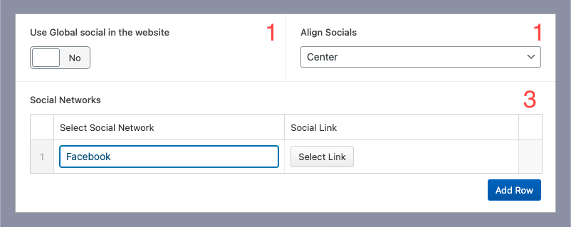
1.- Turn On to use the Socials from Global, or Custom Socials from Social networks fields from this Block
2.- Align Socials: flexbox aligns Left, right and center.
Example
UrVenue FAQ Block
Do you have brunch?
Yes we do! We offer brunch on Saturdays and Sundays at 10 AM – 3 PM.
Do you have brunch?
Yes we do! We offer brunch on Saturdays and Sundays at 10 AM – 3 PM.
Do you have brunch?
Yes we do! We offer brunch on Saturdays and Sundays at 10 AM – 3 PM.
Block: UrVenue Terms
Privacy policy

1.-Privacy Policy Details
2.-Add Urvenue Privacy: Active if the site has UV inventory
Simple Gallery Block
Block Name: UrVenue Gallery

1.-Gallery Style:

a) Simple Gallery: Gallery 4 images/row

b) Masonry Type 1: Used On About Page

c) Masorny Type 2: used On gallery Pages

2.- Turn On the CTA Lightbox on the images
3.- Gallery Images: Gallery field (remember to optimize the recommended size: 1920 x 1280. the ideal size for the lightbox view)


Tab Gallery
Same as a Simple gallery block, but this allows us add multiples galleries grouped on tabs